This is my addition to the world of totally css popup bubbles: borders on tooltips - life changing, I know.
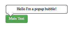
The challenge is this: create a pop-up bubble for an element with no non-semantic elements, with the end result looking something like this:
Html-wise I've opted for the following (I'll argue why later....):
 <article class="popup">
    Main Text
    <aside>Hello I'm a popup bubble!</aside>
</article>
here I've used <aside>'s "Additional content to an <article>" definition.
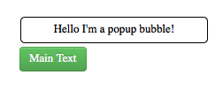
So to start with I want the <aside> to be taken out of the flow of the page and positioned with absolute reference to the main text:
.popup{ position:relative;}

.popup > aside{
    position:absolute;
    bottom:120%;
    left:0;
    background: white;
    color:black;
    border:1px solid black;
    border-radius: 5px;
    padding:5px;
    width: 200px;
}
(with some border-radius for good measure):
The main text's CSS is taken from the great twitter bootstrap, and isn't necessary for the demo but is nice eye candy!
Now comes the challenging bit: how to do the tag at the bottom? My first thought was to use a "V" in the content of a psudo-class, positioned correctly, but that just looked weird! So I turned to a nicety of the CCS border spec: the ability to make triangles with CSS.
So I dutifully put a nice triangle in the :before pseudo element:
.popup > aside:before {
    content: ".";
    color:transparent;
    position: absolute;
    top:100%;
    width: 0;
    height: 0;
    left:4px;
    border-left: 11px solid transparent;
    border-right: 11px solid transparent;
    border-top: 11px solid white;
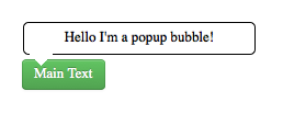
}However this isn't quite right:
And this is where most tooltip/popup bubble solutions stop: they put the tooltip text in a data-attribute then use one pseudo element to display it and the other to make the tip, however because the tip was made with the border properties of the pseudo element you can't add an additional border onto the tip. However by using the <aside> element this gives use three elements to work with (aside, aside:before, aside:after)* still without adding any non-semantic elements. The question is then, can we use this third element to add a border to the tooltip? Why yes!
By knowing the rendering order of pseudo element, you can use the :before element to make a black tooltip then the :after element to make a (slightly smaller and moved slightly right) white tooltip that then gets rendered on top:
.popup > aside:before,aside:after {
content: &quot;.&quot;;
position: absolute;
color:transparent;
top:100%;
width: 0;
height: 0;
left:4px;
border-left: 11px solid transparent;
border-right: 11px solid transparent;
border-top: 11px solid black;
}
.popup > aside:after {
left:5px;
border-left: 10px solid transparent;
border-right: 10px solid transparent;
border-top: 10px solid white;
}Finally, adding some hover transition bling gives the final result:
Browser-wise: this works in current Firefox, Chrome, Opera, Safari and Android. Being a linux guy I don't know if it works in IE but my assumption would be it'll work in IE9+ and could be polyfillied for IE8 and below (see cc3pie and selectivizr), but tell me in the comments if I'm wrong!
As final point: tooltips are great if the user is on a desktop, but on a mobile they often go off the edge of screen and can suck. So consider putting in a media-query into your css and restyling your tooltips for small screens.
* techinically there are 5 elements including .popup:before and .popup:after but that feels a bit cheeky to use these, as the tooltip is all about the <aside> element, and it's good to leave these pseudo elements for additional styling of the main <article>.

 Demo
Demo Demo
Demo Demo
Demo