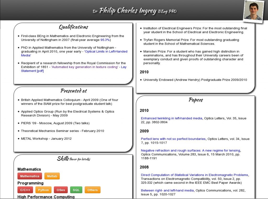
Recently I set about updating my cv and I decided to overhaul it into a web-page: one that works on any size device and that nice reformats for print... however this turned out to not be as straight forward as I first though! The final version of the cv can be found here:
http://philingrey.com/cv/ (html version)
http://philingrey.com/cv/cv.pdf (printed version)

And the source can be found at https://github.com/pci/cv/. There were a few lessons that I learnt the hard-way and thought best to share:
Lessons Learnt
Multi-Columns
Multi-columns are nice in theory - why should the number/width of columns be hard-coded, when instead the browser could work out what's best (according to your CSS criteria). However there are some issues:
- Firefox - doesn't have "break-inside" support, so is happy to split a section across two columns, even if that's not what you want
- Webkit (safari/chrome) - doesn't have multi-column support for print, and the last update on this was several years ago so it doesn't look like it'll come soon!
- Opera - any shadows that cross a column line are cut off, this might be preferable but it is the only browser to do so.
- IE - only IE10 has multi-column support and it's be several years before that's a mainstream browser (IE9 is only just breaking in)
Given these issues you might think it's best to avoid multi-column, but it really is a great thing that I'd recommend people use today. Why? Because the worse case is that a browser doesn't support it and the content naturally degrades to a single column. Also browser support is growing by the day and the spec seems fairly settled (also html5please.us agrees - so it must be ok to use!).
Box-shadow
Friends don't let friends use box-shadow in print. Ever.
Either it's all the browsers or it's the "print to pdf" but something likes to turn any box-shadows into nice black rectangles all over the page!
Touch and Hover
Finally, and this one makes a lot of sense, touch devices (mobiles, tablets, etc.) only send a hover state whilst a finger is pressed down on an element. So any hover tooltips will be obscured by the finger, and as soon as the finger moves the text disappears. To get over this I inserted a few lines of javascript that add a "hovering" class to any elements that have a "hoverable" class in the touch event tree.
[code lang="js"]
window.onload = function(){
/*
Add ongoing hover for touch devices, using event capturing (sent on the way down the DOM) and event bubbling (sent on the way back up)
*/
document.addEventListener('touchstart', function(e) {
hb = document.getElementsByClassName('hoverable');
for (var i = 0; i < hb.length; i++) { hb[i].classList.remove("hovering"); }
}, true);
var hoverables = document.getElementsByClassName('hoverable');
for (var i = 0; i < hoverables.length; ++i) {
hoverables[i].addEventListener('touchstart', function(e) {
this.classList.add('hovering');
},false);
}
}
[/code]
And thus endeth the lesson for today - Let me know what you think!
